BusyBus
Project Details
Duration
4 weeks
Service
Transportation
Role
UX Researcher
UI Designer
Year
2022
Summary
Simplify the search for bus schedules and updates with this quick and easy-to-use app. Busybus is an app that helps users find bus schedules and bus updates in the easiest and fastest way. A client, a transportation agency in a midwest city, wants to provide accurate bus information to its customers using buses. This app allows users to have bus operations, updated bus schedules, and real-time bus information. Moreover, the customers can check directions to a destination with a map in the app. These all features in Busybus help users find accurate details on buses with a simple-looking design.
Overview
Problem
A transportation agency in the Midwest wants to provide real-time bus operation updates through a mobile app. Currently, the agency only shares fixed bus schedules on its website and at bus stops. However, these schedules do not reflect unexpected changes caused by traffic, maintenance, or other delays.
Audience
Bus users in the midwest city.
Solution
This app provides accurate, real-time bus operations and schedules so users know exactly how long they need to wait.
It includes a visual map that displays route changes and updated schedules.
This allows users to check bus operations before arriving at the bus stop.
.svg)
1. Process
1-1. Survey
Goals
1. Understand users’ behaviors and preferences.
2. Identify the value and potential benefits of this app.
3. Develop features informed by quantitative data.
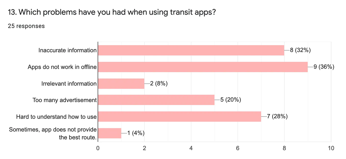
Key Findings
1. 40% of participants reported difficulties with inaccurate information in their current transit apps.
2. 30% of participants said that some transit apps are difficult to use.
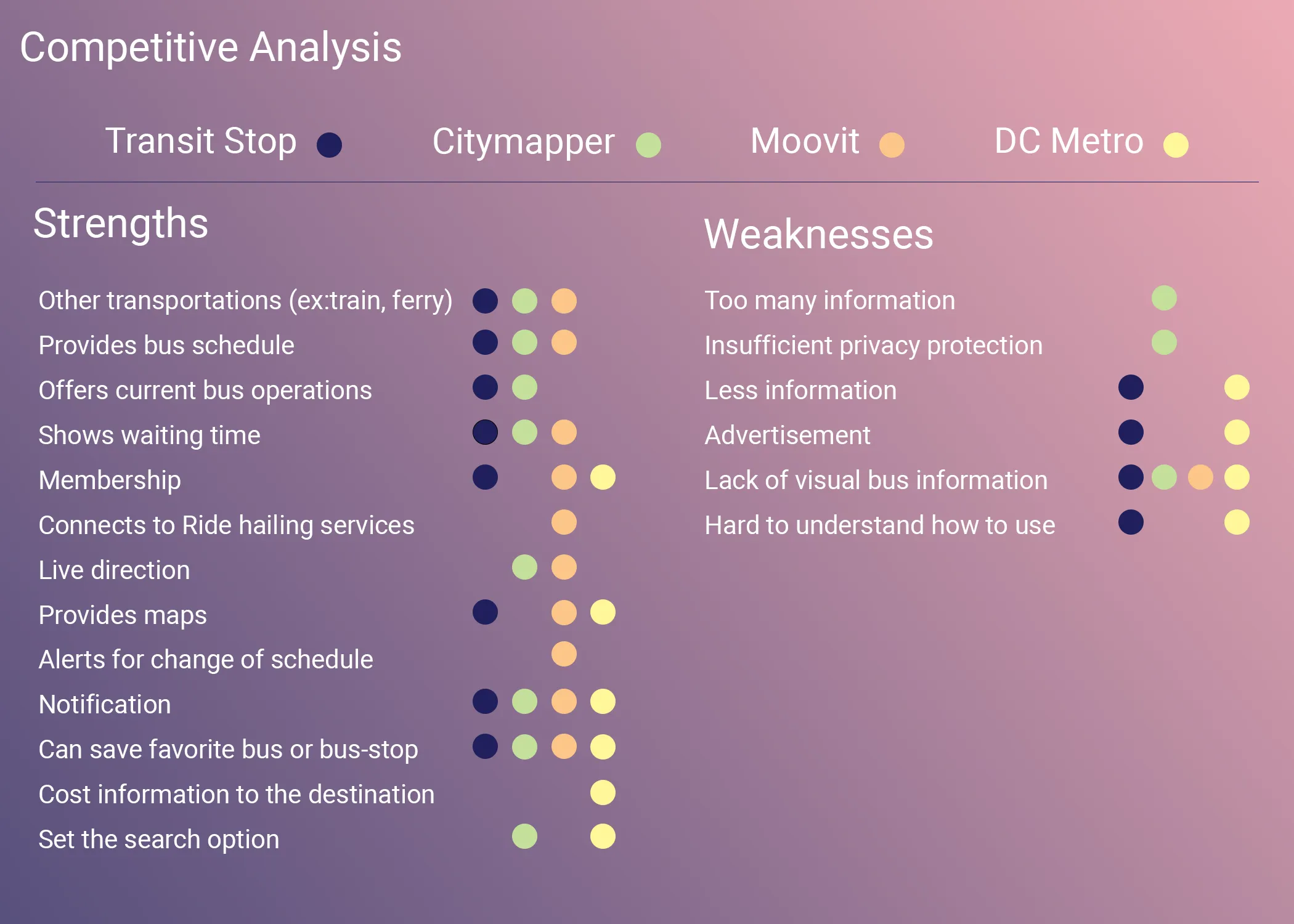
1-2. Competitive analysis
I compared four popular transit apps—Transit Stop, Citymapper, Moovit, and DC Metro—commonly used by bus riders. The goal was to understand which services and features these apps provide and how they support user needs.
From this analysis, I identified several strengths to incorporate into the new app:
- Real-time bus schedules
- Current bus operation status
- Accurate bus waiting times
1-3. User Personas
Based on the survey findings and competitive analysis, I created two user personas: Ellan and Jake. These personas guided the development of key app features by highlighting user behaviors, goals, and pain points when using buses and other transit apps.
Key features inspired by their needs include:
- Live directions on a map
- Push notifications for updates
- Quick access to favorite buses, bus stops, and destinations
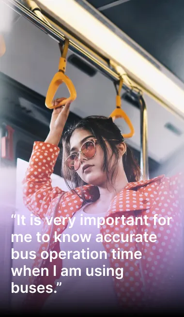
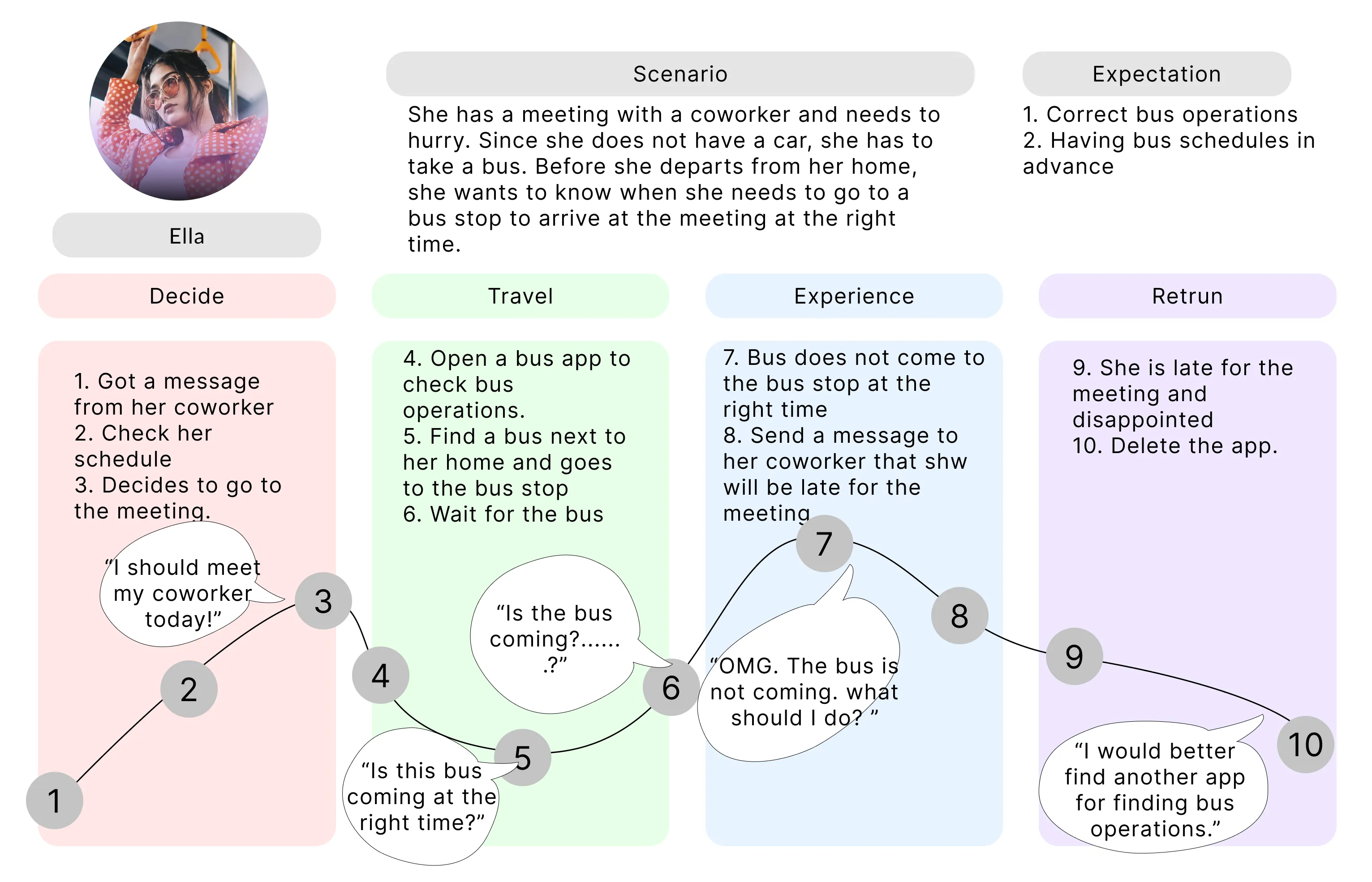
Ella: a working mom
Motivation
Ella is a busy working mom with a tight schedule.
She wants accurate bus operation information to plan her day and calculate wait times, especially in the morning and after work when picking up her son from daycare.
She also wants a daily bus schedule to organize her day efficiently.
Needs / Goals
Know the exact arrival time of the next busReceive real-time updates on bus schedules
Plan her day before leaving home
Frustrations
Inaccurate bus information
Excessive advertisements in transit apps
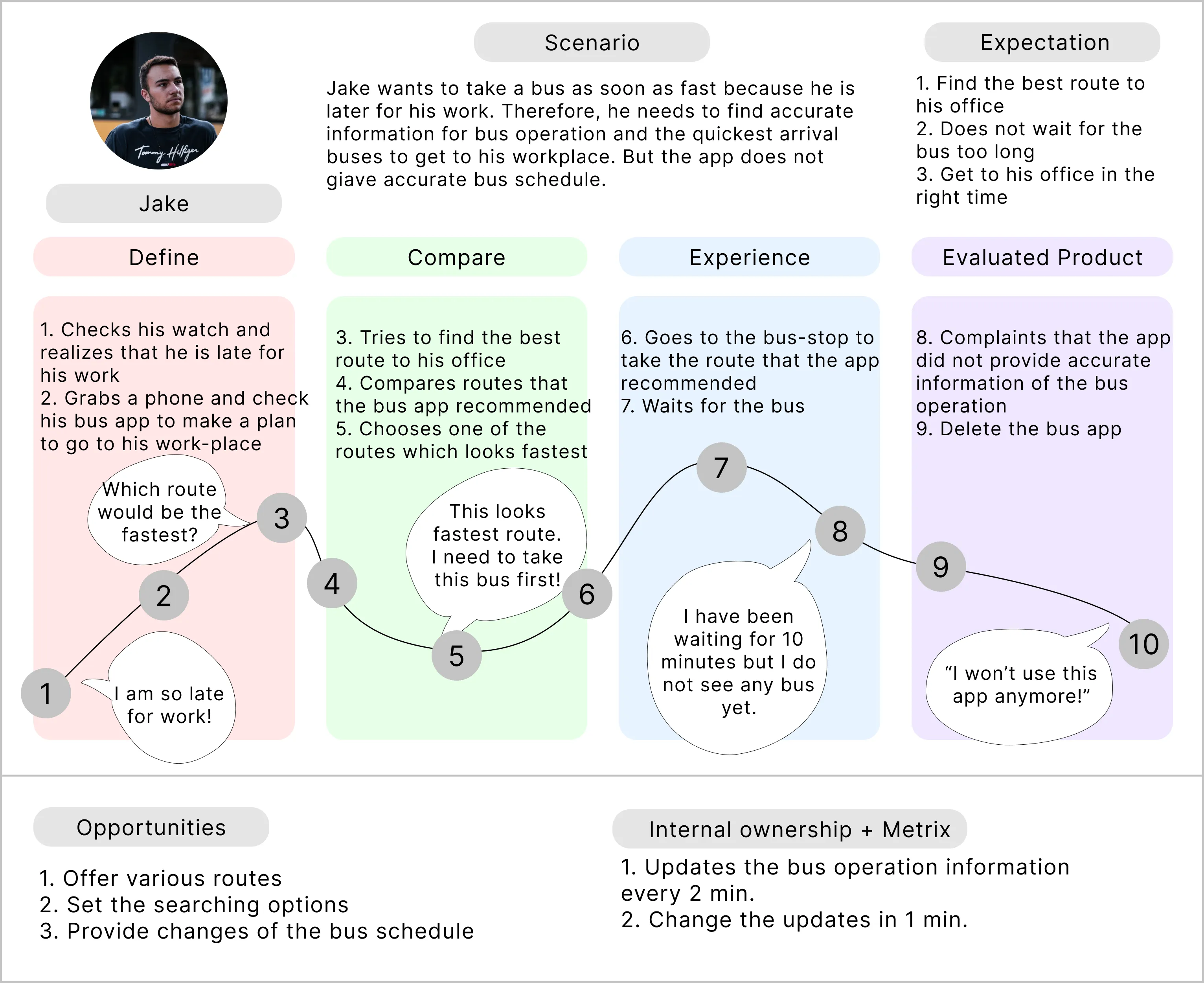
Jake: a busy engineer

Motivation
Jake relies on accurate bus information to estimate wait times and efficiently manage his transfers.
He wants to save his favorite routes and have a simple, easy-to-use transit app.
Needs / Goals
Access accurate and detailed bus information for transfersUse a simple, intuitive app interface
Receive real-time bus updates
Save multiple bus transfer routes
Frustrations
Apps that are complicated or hard to use
Inaccurate information for transfers
1-4. User Journey Mapping
Based on the personas, I created a user journey map to visualize the flow users follow to achieve their goals in specific scenarios. This helped me identify key touch points, pain points, and opportunities to improve the user experience throughout the app.
Empathy Journey Map: Ella
Empathy Journey Map: Jake
2. Information Architecture
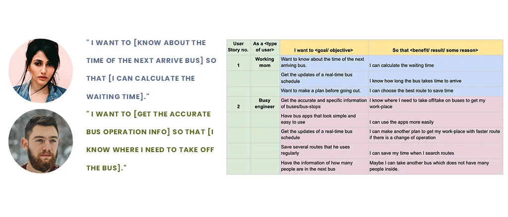
2-1. User Stories
After creating the personas, I defined users’ motivations and goals when using the bus app. These user stories helped me identify essential content and features to provide accurate, straightforward bus information.
2-2. User Flows
The app flow starts with a login page and permission requests for location and notifications. Users can then search for buses, bus stops, or destinations using the search bar. They can search by bus number or bus stop name. Selecting a bus provides detailed information, including all stops along the route. Users can also search for a destination to see which buses will get them there and estimated arrival times.

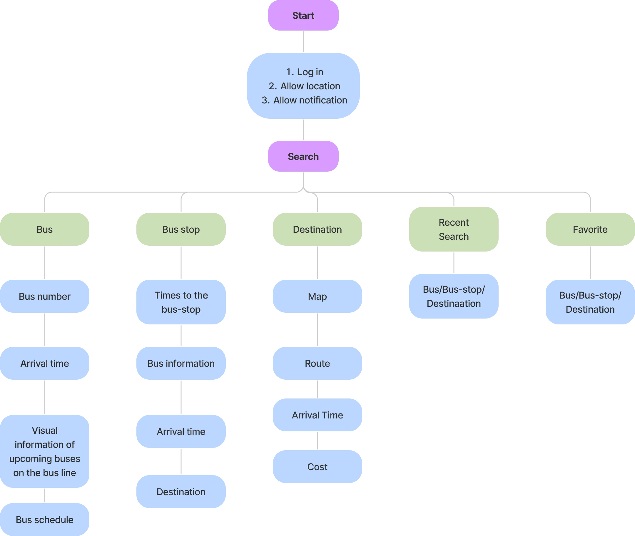
2-3. Sitemap
The sitemap illustrates the app’s structure and content. After setting up login, location, and notification preferences, users can access information about buses, bus stops, destinations, recent searches, and favorites.
2-4. Wireframe Sketches
The sketches show the initial app flow: a “Get Started” button, followed by three cards guiding users to login, grant location access, and allow notifications. Afterward, users reach the search page with a search bar, favorites tab, and recent searches tab. A map displays available routes to a destination, along with bus and bus-stop details.
3. Brand Development
3-1. Brand Characteristics
- Simple design for clear usability
- Warm and friendly tone
3-2. Logo Design and Process
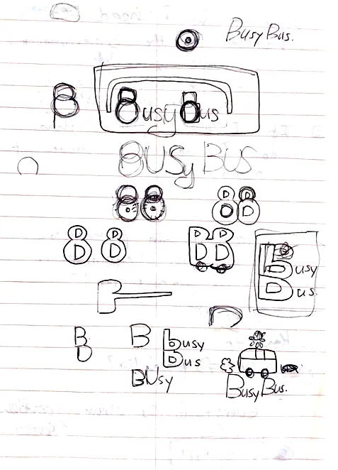
The logo incorporates bus imagery, using tire-like shapes for the “B”s in “BusyBus.” Several concepts were explored before selecting the final design.

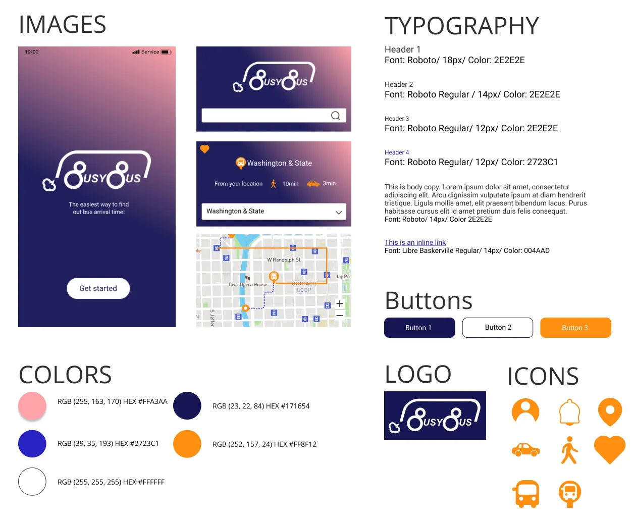
3-3. Style Guide
I developed a full style guide including images, colors, typography, buttons, logos, and icons. The color palette uses gradients of dark blue and pink to convey professionalism and approachability. Roboto, a clean sans-serif font, ensures clear and readable bus information. Buttons, logos, and icons are designed to be simple and intuitive, prioritizing usability.
4. Usability Test
Using the high-fidelity mockups, I conducted usability tests to:
- Gather insights on how users interact with the app
- Evaluate the product with potential users
- Identify unexpected issues or pain points
4-1. Revised Design
Post-testing improvements included:
- Expanded search options: shortest time routes, minimal walking, fewest transfers, lowest cost, fewer people
- Enhanced map information: walking time to bus stops or destinations

5. Prototype
5-1. High-Fidelity Mockups
The high-fidelity mockups reflect the research, survey insights, branding, wireframes, and usability testing.
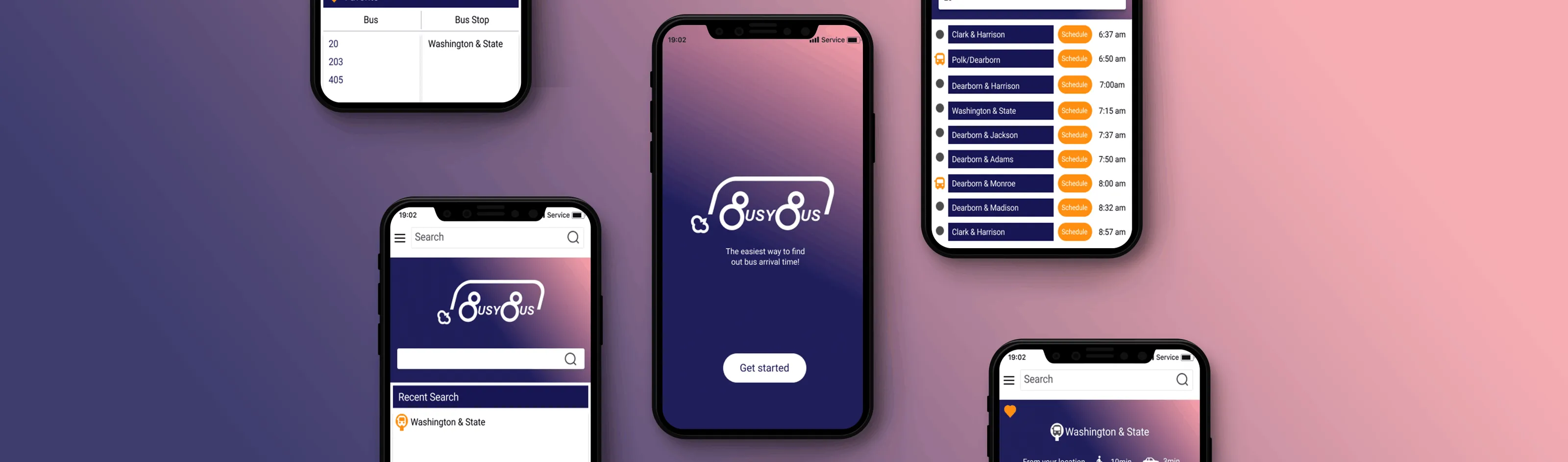
5-2. Key Screens
Key screens show real-time bus operations and accurate schedules, emphasizing clarity and usability.
Final thoughts
- More time and resources would improve the visual map’s functionality.
- Additional colors for bus lines would help users quickly distinguish routes.
- Designing the app was highly rewarding, especially seeing its progress.
- Logo design took longer than expected, but it was a great opportunity to showcase creativity.
- Conducting surveys and interviews helped me understand users, while also refining my decision-making process.
- I learned that working smarter, not just harder, will be essential for future projects.
%20(1).svg)