ArtNKids
Project Details
Industry
Education
Service
UX|UI Design
Role
UX Researcher
UI Designer
Year
2022
The Challenge
The market currently lacks a seamless, unified service for parents seeking at-home art education for their young children. Parents of children aged 2 to 10 face several key obstacles when trying to nurture their child's creativity:
1. Fragmented Offering: No single platform conveniently offers both on-demand virtual art lessons and curated, complementary physical art activity kits. Parents must juggle multiple subscriptions and suppliers.
2. Lack of Confidence: Without a free trial, parents are hesitant to commit to virtual lessons or kits, worried about whether the content or materials will engage their specific child.
3. Guidance Gap: Parents often struggle to determine the most appropriate lesson or kit based on their child's age, skill level, or interest, leading to frustrating purchase decisions.
The Audience
Our primary audience is busy, digitally-savvy parents of children aged 2–10 who actively seek convenient, high-quality, and engaging creative learning opportunities for their kids at home. They value convenience and need tools to confidently make the right educational choices for their young learners.
The Proposed Solution: ARTNKIDS
ARTNKIDS is a web-based service designed to be the ultimate single-stop platform for at-home children's art education. We provide a diverse and interactive experience by combining the flexibility of online learning with the tangibility of physical art supplies.
The core solution features are:
1. Unified Platform: Access a vast, curated library of online art lessons and order complementary activity kits for doorstep delivery, all through a single, intuitive interface.
2. Try Before You Buy: A free trial option for virtual lessons or a sampling kit allows parents to gauge their child's interest and suitability before making a commitment.
3. Personalized Support: An instant, on-site chatbot is available on every page to provide immediate, tailored guidance, helping parents confidently match lessons and kits to their child’s specific needs and interests.
4. Effortless Ordering: A streamlined user experience allows for single-click ordering and management of both digital subscriptions and physical kit deliveries.
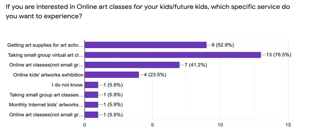
1. User Survey:
I conducted a survey to understand parents' current behaviors and preferences related to at-home art education. The quantitative data gathered informed the subsequent design decisions and helped identify critical feature gaps in the existing market.


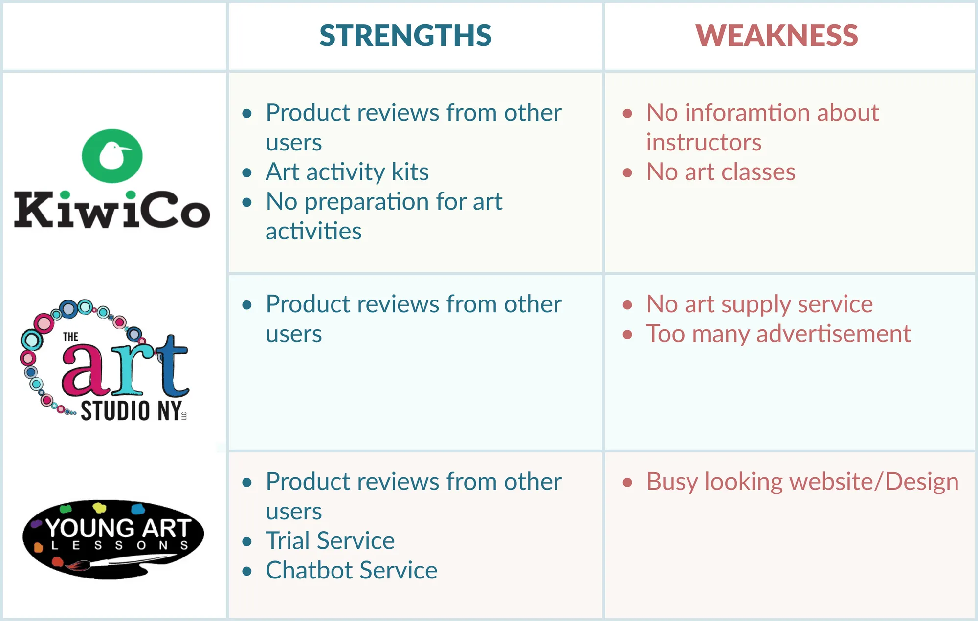
2. Competitive Analysis:
I examined three services—KiwiCo, The Art Studio NY, and Young Art Lessons—to map their feature sets, service delivery models, and overall user experience. This analysis was crucial for pinpointing competitor strengths and uncovering opportunities for ARTNKIDS to offer a truly unified and differentiated service.
B. Defining the User: Personas & Needs
Based on the survey findings and competitive insights, I created four comprehensive User Personas (Sarah, John) to anchor the design process.
Meet, Sarah!

“I want to spend quality time with my kids, and I’d love for them to make friends through virtual art lessons.”
Demographics
A 35-year-old WFH mom balancing work and three kids.
Behaviors
Balances a busy schedule between work responsibilities and childcare.
Manages and plans all of her kids’ schedules.
Attempts to arrange playdates but often finds it challenging due to time constraints.
Goals
Provide her kids with fun and engaging art activities.
Avoid the hassle of preparing materials by using ready-to-go activity kits.
Expose her children to a variety of art experiences.
Help her kids build connections and friendships through online interactions.
Meet, John!

“I want to have a great time with my kids and create precious memories together.”
Demographics
40-year-old working dad living with two children.
Behaviors
Struggles to spend enough time with his kids due to work commitments.
Makes an effort to play or engage with them at least twice a week.
Goals
Seeks special events to enjoy with his children.
Aims to ensure his kids are happy and satisfied with the activities he plans.
Wants to know exactly which art activities his children will experience before committing to a service.
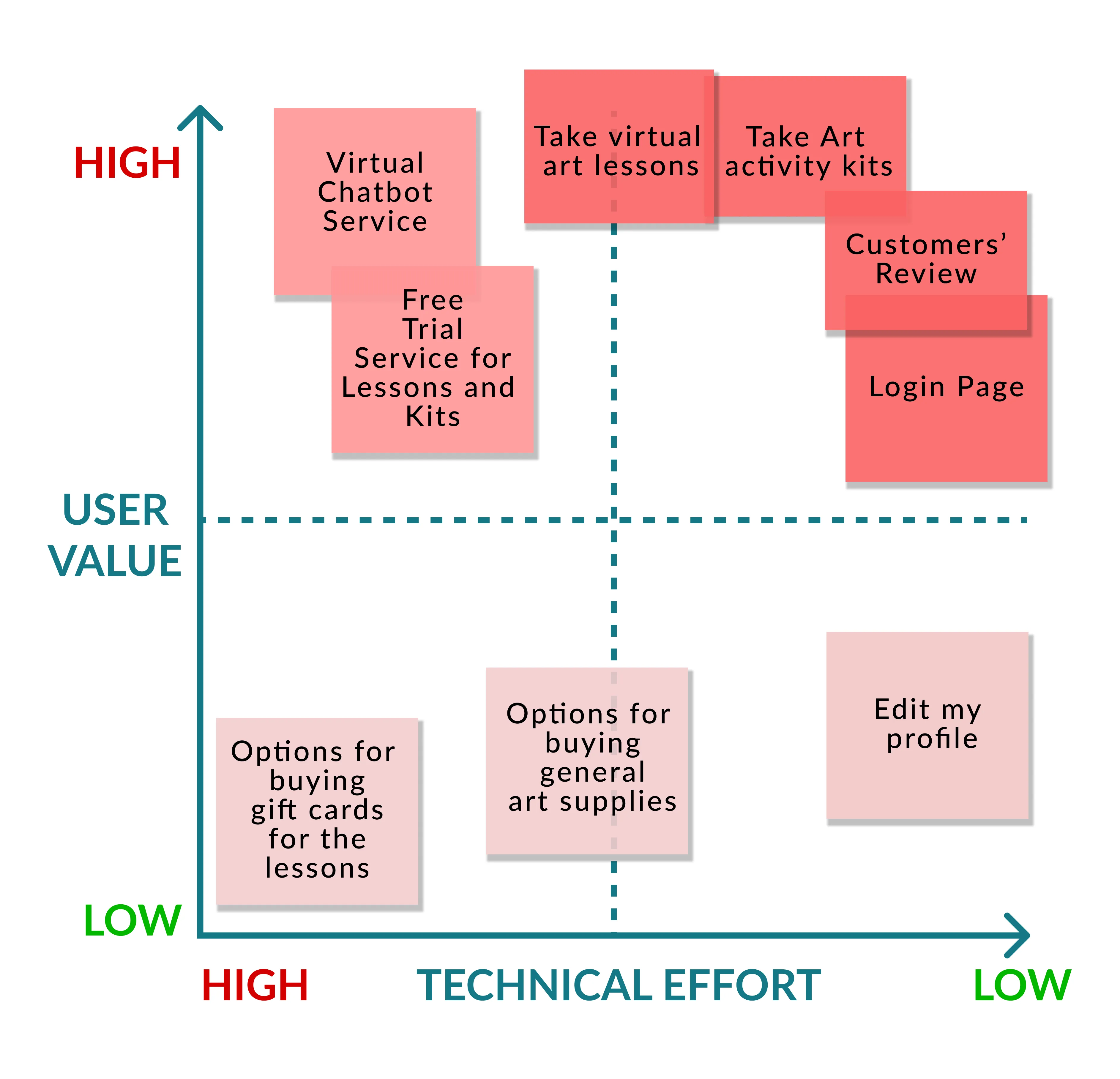
The insights derived from these personas directly informed the core product features:
The insights derived from these personas directly informed the core product features:
1. Small-Group Online Art Lessons: Designed to help children build social connections while giving parents the opportunity to enjoy creative time with their kids.
2. Ready-to-Use Art Activity Kits: To allow parents to skip the preparation phase entirely, delivering engaging, ready-to-use art experiences straight to their door.
3. Free Trial Lessons: To address parental hesitation and allow families to confidently preview the activities before committing to a full subscription or purchase.
2. Information Architecture
With the core features defined by user needs, I moved into structuring the platform to ensure a seamless and intuitive experience.
User Story 1 — Working Mom with Three Kids
I want to
<Goal/ Objective>
I want my kids to have online art lessons at home and access to creative art activity kits.
so that
<Benefit/ Result/ Some reasons>
I can focus on work while my kids attend lessons, where they develop their creativity and make friends through virtual classes.
User Story 1 — Working Dad with Two Young Kids
I want to
<Goal/ Objective>
I want to have fun opportunities with my kids and try free trial services before making a purchase.
so that
<Benefit/ Result/ Some reasons>
I can create meaningful memories with my kids and find out if they enjoy the art lessons or kits before committing.
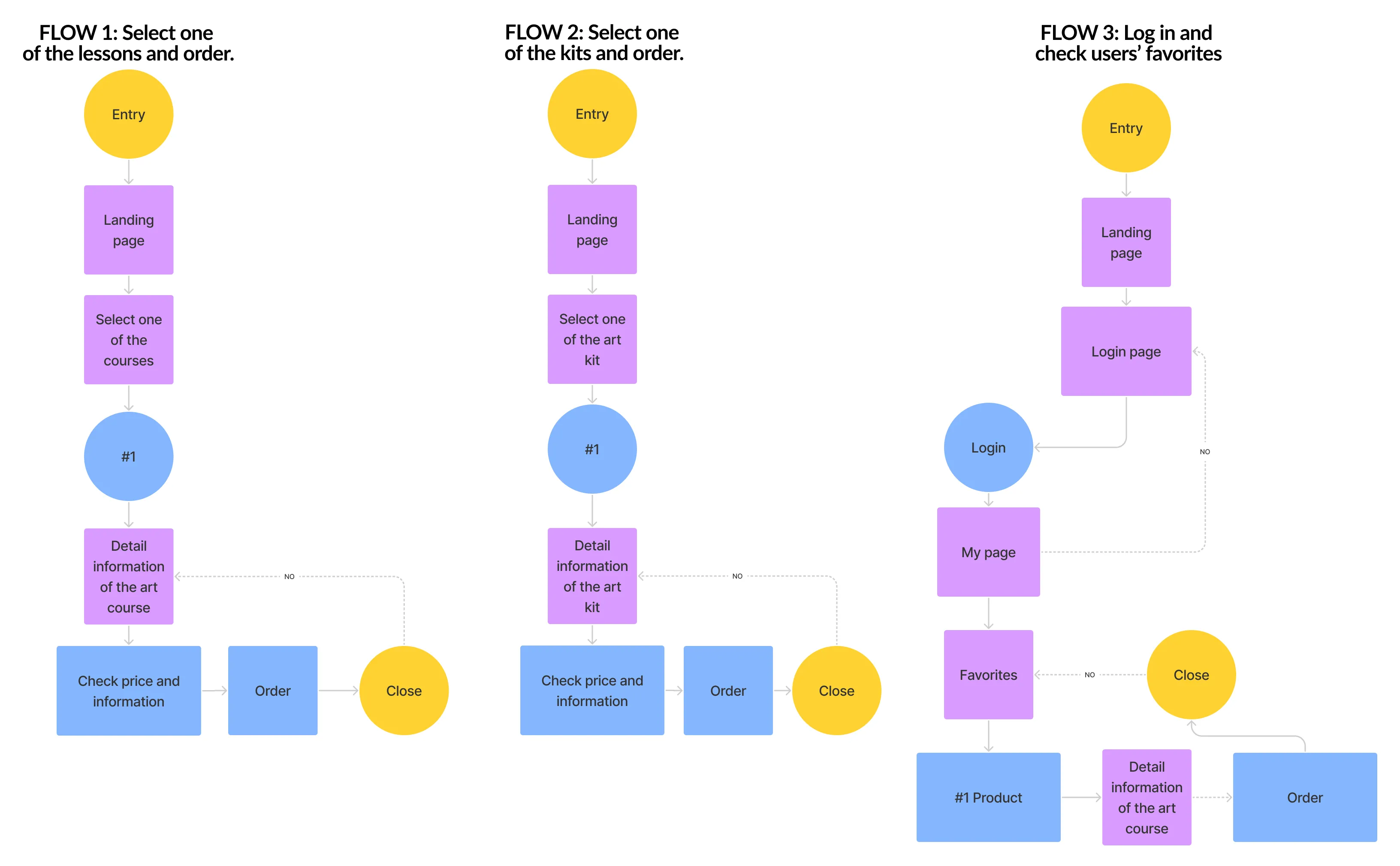
2-3. User Flows
Next, I created detailed step-by-step user flows based on the prioritized features from the matrix to ensure all necessary screens were included for the prototyping stage.
3. Sitemap and Wireframing
With the core user needs, flows, and content requirements established, the next phase involved translating the architecture into tangible screen designs, focusing on clarity and ease of navigation for busy parents.
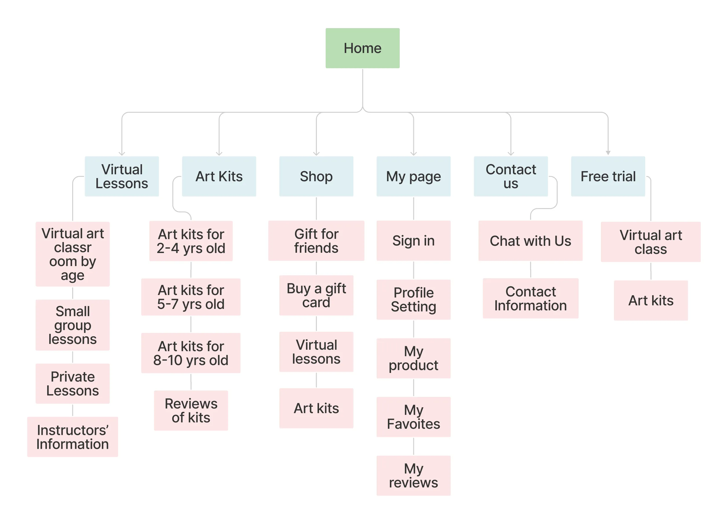
A. Sitemap: Structuring the Unified Experience
The Sitemap was designed to seamlessly blend the digital (lessons) and physical (kits) components of ARTNKIDS. Its key structural decisions include:
1. Core Offerings: Clear separation between Virtual Lessons and Art Kits as primary navigation items, alongside a dedicated Shop menu for standalone art supplies and gifts.
2. User Management: A dedicated My Page section allows users to easily view Favorites, manage their profile, and track orders—all in one place.
3. Conversion Path: A prominent Free Trial option is placed in the main navigation to facilitate quick enrollment and address the user need for pre-purchase confidence.
4. Support: The Contact Us tab ensures easy access to the support team, reinforcing the guidance provided by the on-site chatbot (as detailed in the solution).
B. Wireframes: Defining the Interface
I began with sketches to rapidly iterate on the visual hierarchy and content placement, covering critical screens such as the Home Page, Virtual Lesson Details, and Art Kit Details.
The subsequent digital wireframes were focused on achieving maximum clarity and information density. I prioritized developing content layouts that effectively convey the necessary information about each product—whether a time-slotted online class or a physical box of supplies—allowing parents to confidently compare and select the best option for their child.

Below is a link to the wireframes, created from the initial sketches. I focused on developing content that clearly conveys information about the online art lessons and art activity kits.
.svg)
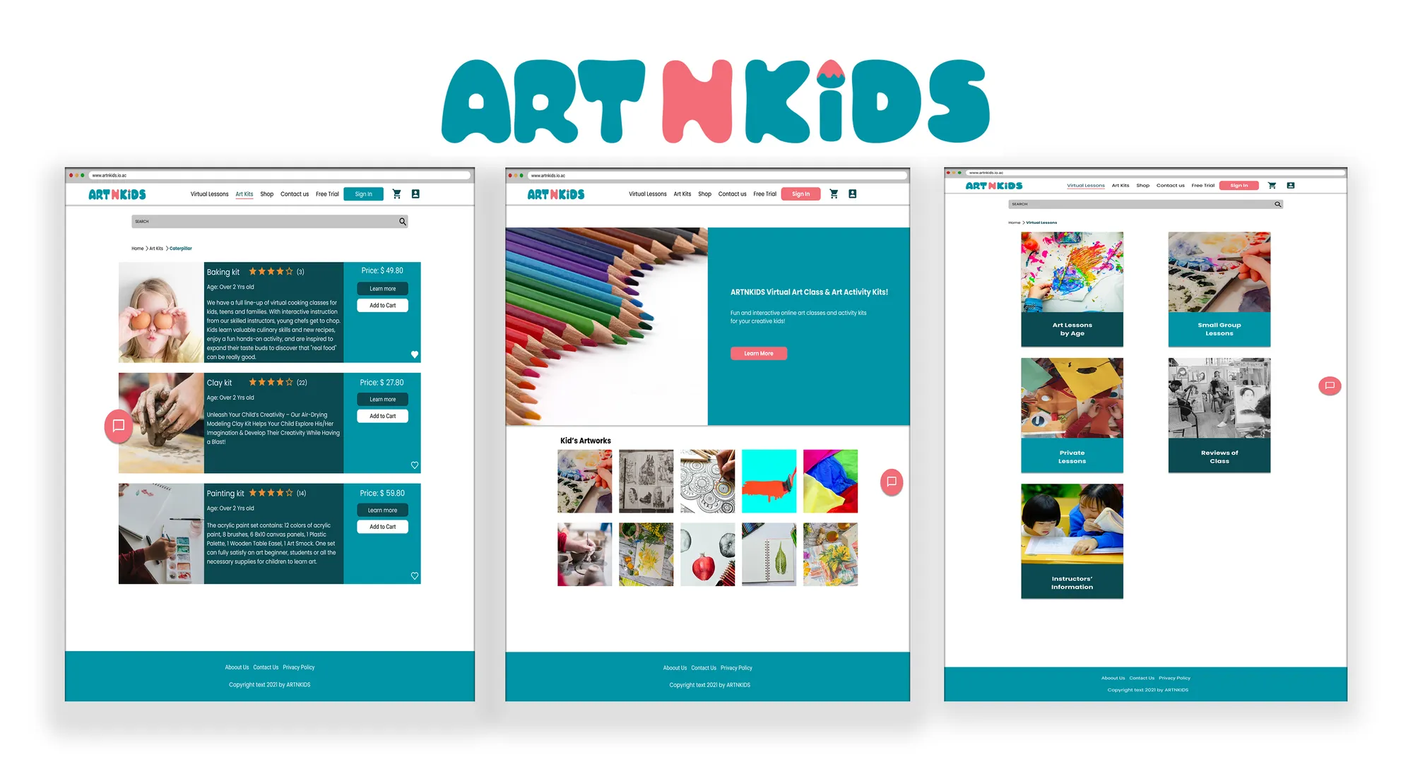
4. Visual Design and Branding
The brand identity for ARTNKIDS was crafted to be cute, simple, and highly approachable, specifically targeting young children (ages 2–10) and their parents.
A. Brand Characteristics
To ensure ease of use for busy parents and appeal to children, the design focused on:
1. Approachability: Creating a friendly, welcoming, and imaginative aesthetic.
2. Simplicity: Prioritizing clean layouts and intuitive content presentation to ensure users can easily find information and products.
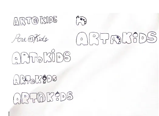
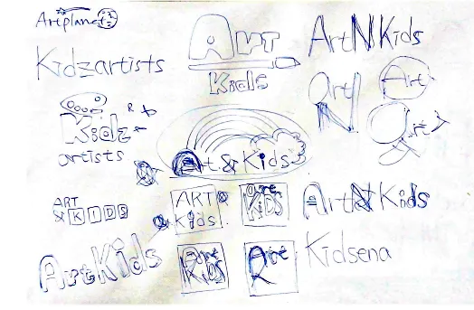
Before creating the logo, I carefully considered the product name. After much thought, I chose “ARTNKIDS” for the online art lessons service. Below are the sketches that reflect my naming process and ideas.
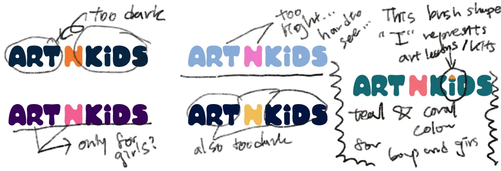
The final logo is designed to be cute and friendly, using soft shapes and a child-like, yet clear, font to ensure immediate appeal to the target demographic.
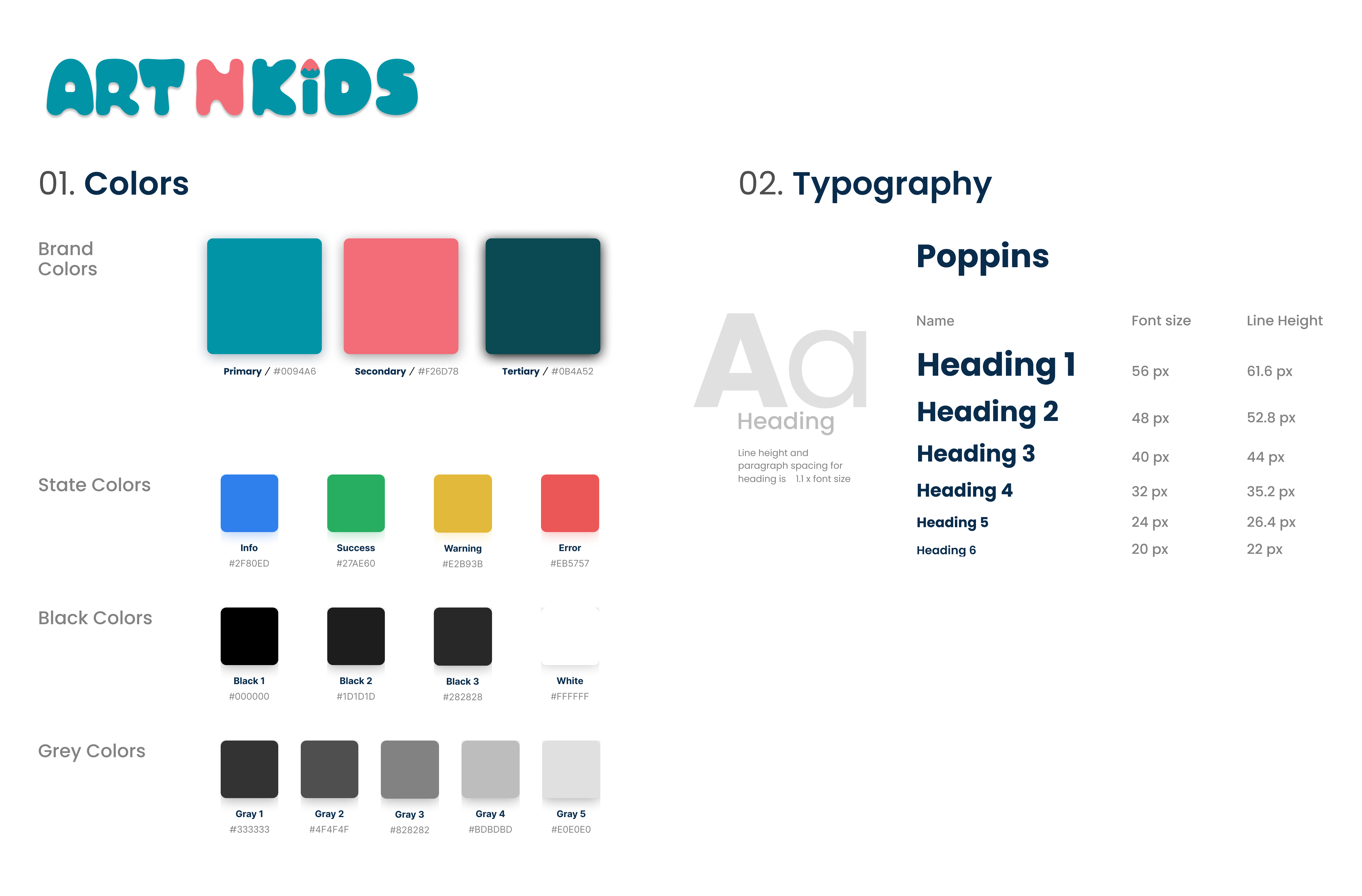
C. Style Tile and Visual Language
The Style Tile defined the complete visual language for the high-fidelity mockups:
1. Color Palette: I selected colors that feel familiar and appealing to children: Soft Pink and Light Blue as primary colors, complemented by a Vibrant Orange for accents (like CTAs), and a Dark Bluish-Green for essential information contrast.
2. Typography: I chose Poppins, a friendly, sans-serif typeface. Its slightly wider letterforms were selected to enhance readability for both parents quickly scanning the site and for young users who might be engaging with the content.
4. Validation and Iteration
After developing the high-fidelity mockups, I conducted a Usability Test to validate the design and gather actionable feedback.
A. Usability Test Goals
Usability testing was performed with six participants to:
1. Assess Clarity: Confirm that all content and product offerings were easy for users to understand.
2. Identify Issues: Pinpoint any usability barriers or friction points within the product flows.
3. Gather Insights: Collect qualitative data to enhance the overall user experience before final delivery.
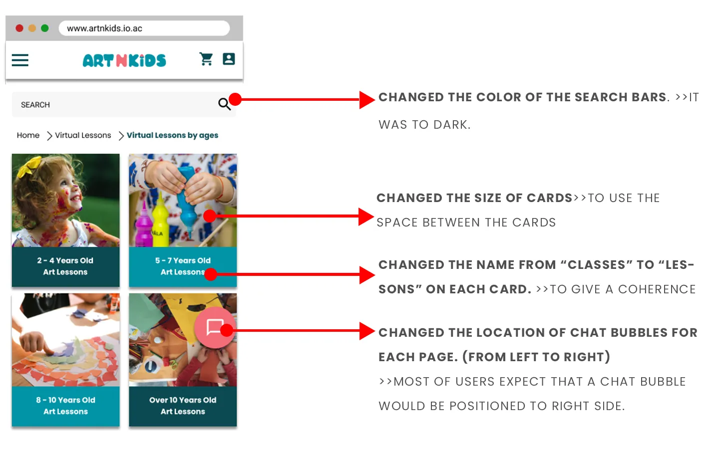
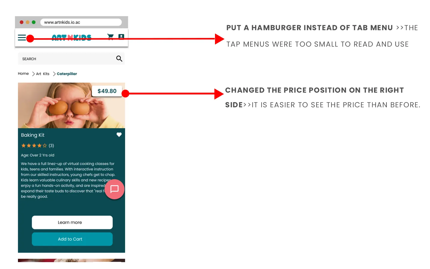
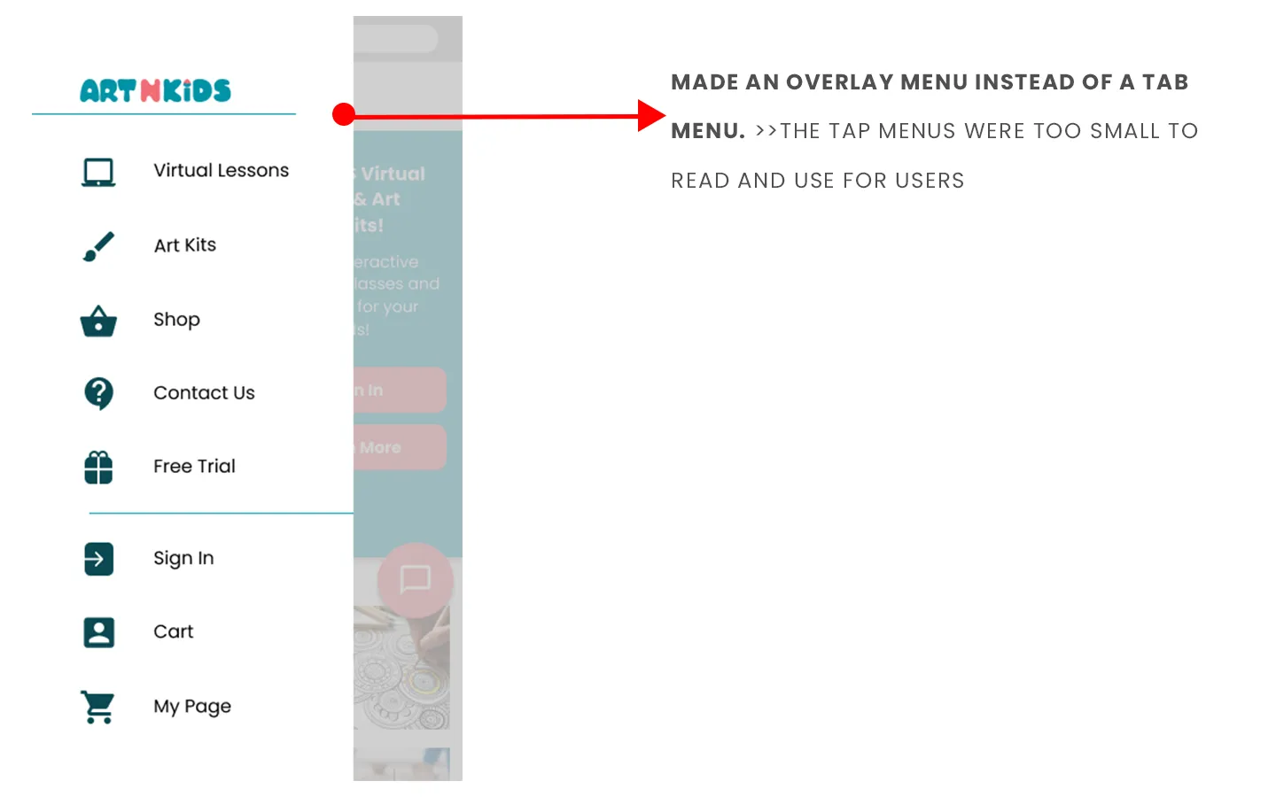
B. Design Revisions
Based on the feedback gathered, I immediately updated and refined the prototypes. Key revisions focused on streamlining navigation paths and improving the visual hierarchy (as indicated by the arrows in the images below), ensuring the final product aligned with user expectations.

Revised design for App (See the arrows and alphabets in the pictures below)
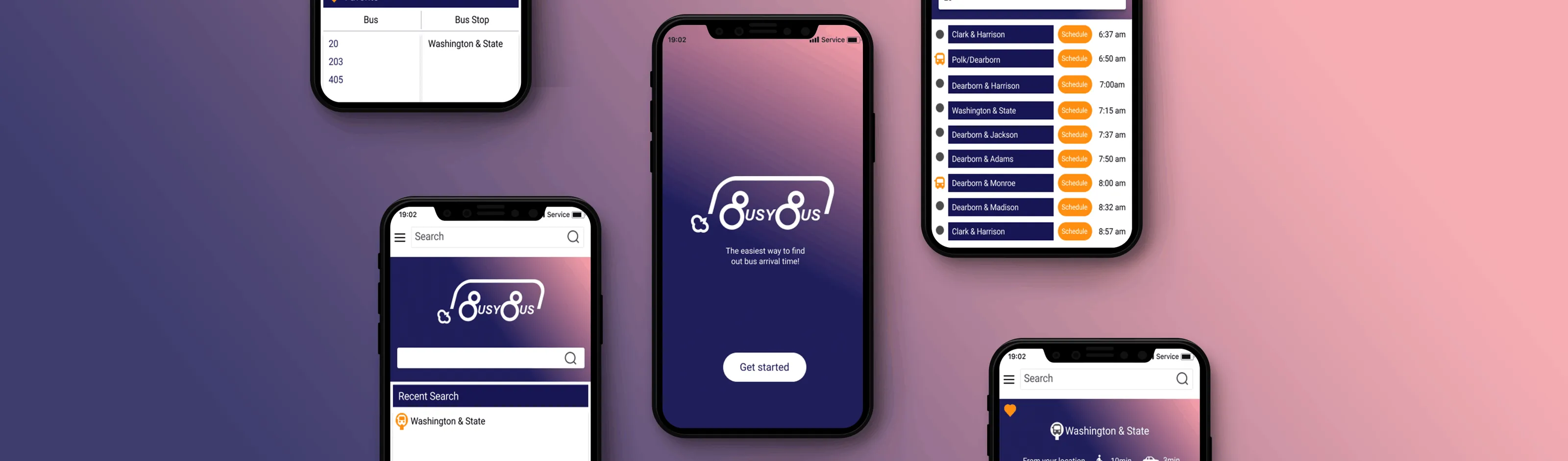
5. Final Prototype & Key Takeaways
The project culminated in High-Fidelity Mockups for both the website and a companion app, allowing users to learn about and purchase art lessons and kits seamlessly across multiple devices.
Final Thoughts
The development of ARTNKIDS reinforced several core design principles:
1. Platform Adaptability: It is essential to adapt the information architecture and content to the specific browsing platform (web vs. app) to optimize the user experience in different environments.
2. Visual Hierarchy: Using color and contrast effectively is paramount for highlighting crucial interactive elements, such as call-to-action buttons.
3. Targeted Branding: When designing for a dual audience (parents and children), branding must be cute and approachable using familiar and appealing colors to resonate with the primary user (the child) while maintaining simplicity for the purchaser (the parent).
%20(1).svg)